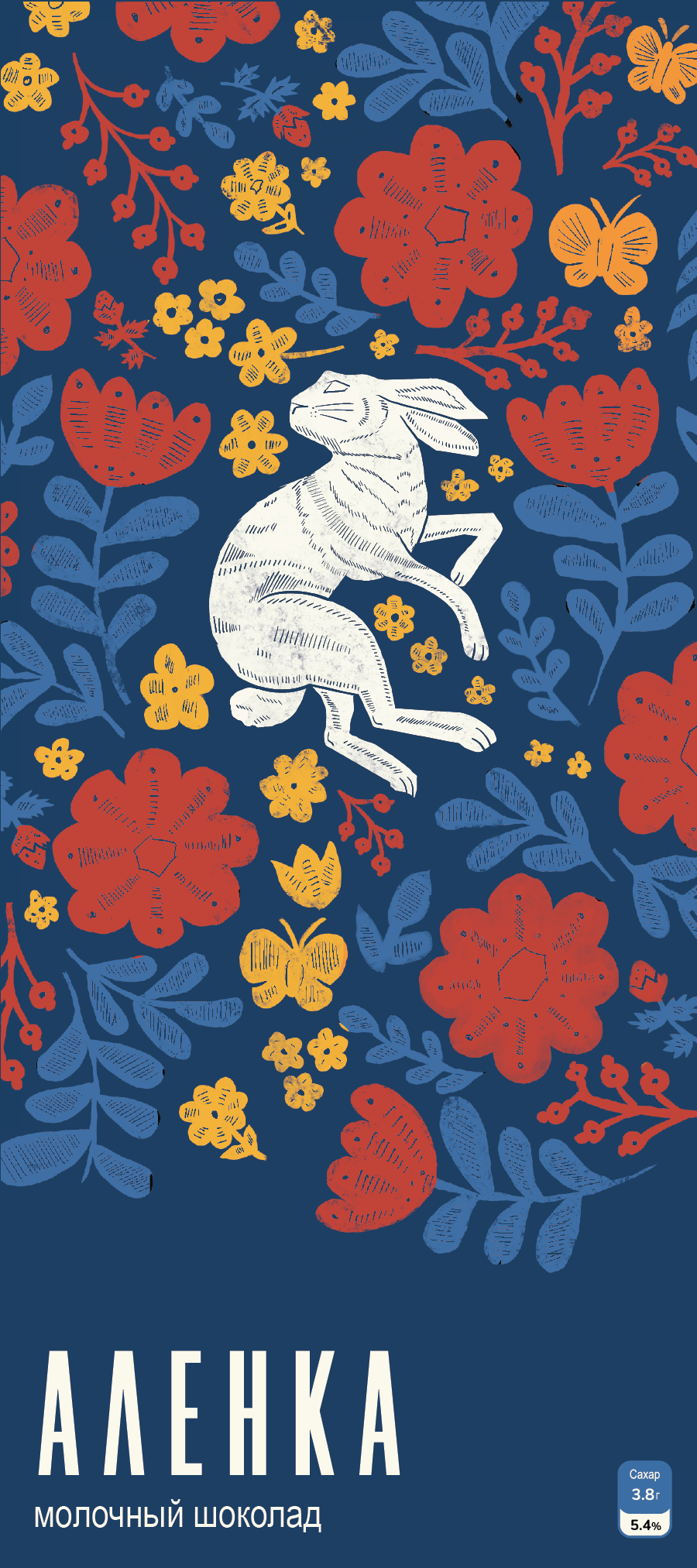
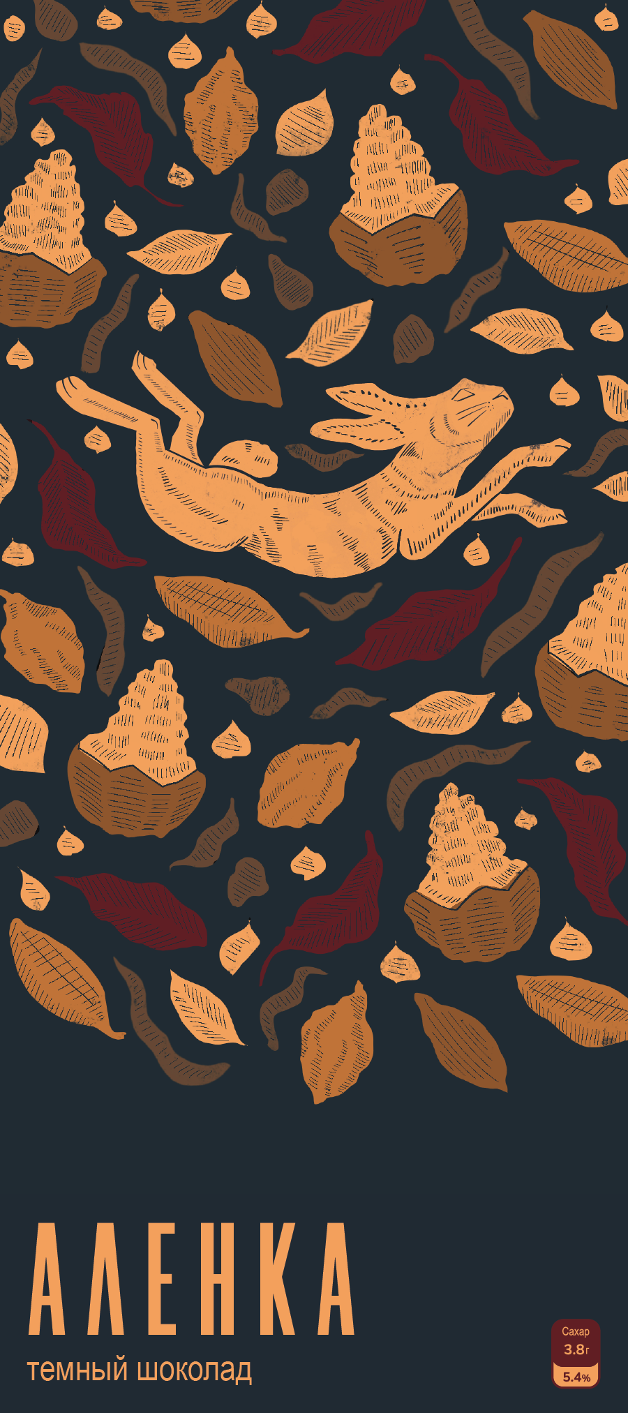
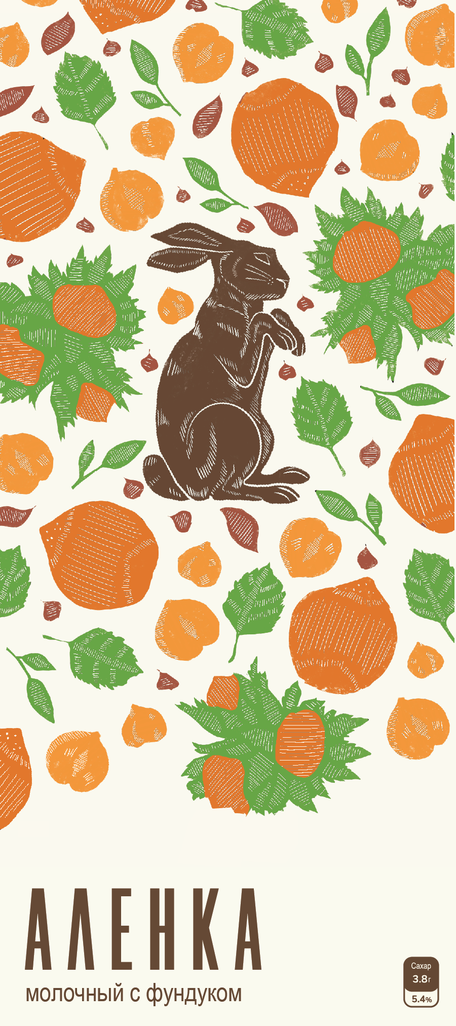
The goal of this project was to revamp Russia’s most popular chocolate brand while still keeping ties to the original soviet design. In place of the Russian version of the Gerber baby, I illustrated rabbits, which are still a symbol of innocence and new beginnings. The designs that surround the rabbits are inspired by Russian folk art and explain what flavor each of the bars is: Milk, Dark, and Hazelnut. The font is clean and minimal compared to the decorative cursive of the original. All in all, the result is a Cinema 4D packaging design of a colorful and modern Russian Chocolate bar.


